You can have the most captivating plot, complex characters, and jaw-dropping twists—but if your book isn’t formatted properly, you risk losing your reader before they reach chapter two. Formatting might not be the first thing readers notice, but it’s one of the first things they feel. Ever opened a book and felt instantly drawn in? Odds are, it wasn’t just the words—it was the way those words were presented.
Book formatting is the bridge between your imagination and the reader’s eyes. It’s what transforms a Word doc into a polished novel. And trust us, readers notice. They might not say it out loud, but their eyes do the talking: Are the margins breathing room or claustrophobic? Is the font easy to read or a chore? Do chapter breaks feel intentional or like an afterthought? Every design choice plays a part in how your story is received.
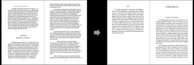
What Exactly Is Book Formatting?
Let’s break it down. Book formatting is the technical and aesthetic process of arranging your text for publication. It includes:
- Setting the trim size and margins
- Choosing fonts and spacing
- Adding headers, footers, and page numbers
- Designing chapter titles and scene breaks
- Making sure elements like images, tables, and footnotes fit smoothly
- Ensuring consistency and readability across devices (for eBooks)
There are two main types: print formatting and digital formatting, and each has its own set of rules and best practices. Print requires precision down to the millimeter, while digital formatting must adapt to various screens and apps without glitching out.
The Reader’s Perspective
When readers open a book, they’re not supposed to notice the formatting. That’s the golden rule. If your formatting draws attention to itself—crooked headers, weird line breaks, inconsistent spacing—it breaks the immersion. Suddenly, your reader is thinking about the book instead of the story.
Poor formatting can lead to:
- Eye strain
- Confusion about dialogue or scene changes
- Annoyance at inconsistent alignment
- Misinterpretation of pacing or tone
- A feeling that the book is “unprofessional” or “unfinished”
On the flip side, great formatting becomes invisible—because it serves the story, not itself. It guides the reader’s eye, supports the mood, and respects the reader’s time.
Why DIY Formatting Often Falls Short
With so many online tools available, it’s tempting to try formatting your book yourself. And hey, we get it. It seems like a simple enough task. Just choose a font, set some margins, hit export… right?
Not quite.
Here’s the reality: formatting software like Vellum or Adobe InDesign might make the process easier, but they still require an expert eye. A machine can’t tell you when your line breaks feel awkward or your layout doesn’t fit the genre’s expectations.
For example, formatting a fantasy novel isn’t the same as formatting a children’s book or a poetry collection. Each genre has its quirks:
- Poetry often needs creative line spacing and page breaks.
- Nonfiction relies heavily on clear headers and citations.
- Picture books demand exact image placement and alignment.
- eBooks need interactive table of contents and flow-friendly chapters.
When authors DIY without understanding these nuances, they often miss out on the opportunity to truly elevate their work. It’s like painting a masterpiece on a crumpled canvas.
Design That Honors the Story
Good formatting doesn’t just follow rules—it understands the emotional flow of your book. A horror novel might benefit from longer line spacing and sharper fonts. A romance might feel more intimate with tighter kerning and soft page layout.
Chapter openings should have breathing room. Scene breaks should feel like a pause, not a hiccup. Dialogue should be spaced for flow. All of these subtle touches create rhythm. And rhythm creates immersion.
Formatting is where design meets empathy. It’s about thinking how your reader reads, and designing the experience accordingly.
Bluemount Publisher: Formatting with Finesse
Here’s where Bluemount Publisher comes in—not as salespeople, but as storytellers who care about the experience as much as the craft. We’ve seen authors pour their souls into manuscripts only to feel disheartened when the final version doesn’t “feel” right. Often, that comes down to formatting. It’s not just how the book looks—it’s how it lives.
We don’t slap a template on your story and call it a day. We listen to the tone, the pacing, the genre, and your vision. We explore what feels right for your book, not just what looks good on a shelf. That’s where the magic is—custom formatting that’s invisible to the reader but transformative for the experience.
Whether you’re going for traditional print, eBook, or both, proper formatting bridges the gap between content and connection.
Signs of Great Formatting (and What to Watch for)
When evaluating your own book—or someone else’s—keep an eye out for:
- Consistent font size and style throughout
- Clean margins and balanced white space
- Clear chapter headings and hierarchy
- Smooth scene breaks (like extra line spaces or small graphics)
- Proper alignment of text and images
- Functional table of contents in digital versions
- No widows/orphans (those lonely lines at page tops or bottoms)
- Genre-appropriate layout and typeface
Avoid these red flags:
- Text that feels squished or stretched
- Randomly bolded or italicized words
- Pages that look cluttered or inconsistent
- Headers that don’t match or jump around
- Page numbers mysteriously disappearing
- Incompatibility with Kindle/Nook/etc.
- Overly flashy fonts that kill the tone
The Takeaway: Formatting Isn’t Optional
If you’re serious about publishing—really publishing, not just pushing out content—formatting isn’t something to overlook. It’s not just a technical step; it’s a creative one. A story deserves more than just being read—it deserves to be felt and flowed through.
Formatting is the runway your story lands on. Make it smooth. Make it safe. Make it unforgettable.
And if you’re not sure where to start or you’re feeling overwhelmed, that’s totally okay. Many authors are brilliant at writing but not interested in kerning or gutter margins. That’s where working with people who love this part can make all the difference.
At the end of the day, a beautifully formatted book is like a beautifully wrapped gift. What’s inside may be extraordinary—but when the outside presentation matches the inside magic, the impact is unforgettable.
So when it’s time to format your next book, think beyond the font. Think experience. And if you’re curious how the pros approach it, Bluemount Publisher is always quietly crafting behind the scenes—helping stories shine not just through words, but through the way they’re delivered.
Your story is worth telling. Let the formatting reflect that.