You ever walk into a room and just feel something before anything happens? No one’s even said hi yet, but your brain’s already made up its mind about the mood. That’s color doing its thing. The right colors grab you, calm you, hype you up—depends on what you want.
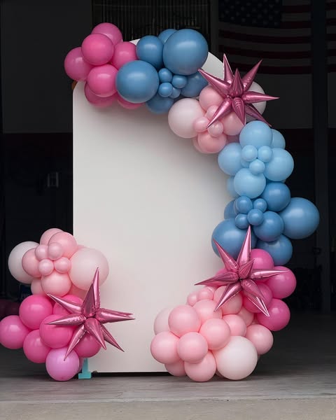
And let’s be honest, balloons are the first thing you notice. Always. They fill up space, they set the tone, and lately, they’ve kind of become the star of the show. They’re not just “decor” anymore. They’re the vibe.
But picking the right balloon palette? It’s not as easy as tossing a few colors together and hoping for the best. It’s a weird mix of instinct, lighting, theme, and just… taste. You can totally get it wrong. And when you do, it’s hard to explain why the setup feels off—it just does. But when you get it right, man, it clicks. Everything looks effortless.
Start with the Mood, Not the Balloons
Every party, every event—it starts with a feeling. That should decide your color direction, not whatever’s trending on social media.
Want something lively, loud, a little wild? Go warm—reds, oranges, yellows. They’ve got that punch. They bring energy. If it’s a chill dinner, or a romantic setup, or a shower—cool tones like blue, sage, or lavender calm things down.
Thing is, colors don’t live in isolation. Lighting, wall colors, even the kind of furniture in the space changes how they read. That dusty pink you loved online might look like beige under soft yellow lights.
If you’re unsure, peek at your invites. Whoever designed them probably nailed a tone already—follow that. It’s usually a good guide for your balloon colors too.
Match the Theme, but Don’t Go Nuts About It
Themes can be great. They give direction. But they can also box you in if you’re too literal.
For kids’ parties? Go wild. Big colors, fun combos. The messier, the better. But for something elegant—like an engagement or milestone dinner—keep it under control. Two main colors, maybe a third accent if you must. Add a metallic or transparent touch if it needs depth.
Let’s say it’s tropical. Everyone rushes to grab every bright shade they can find—stop. Pick one main tone, maybe coral or turquoise, then use lighter or darker versions of that. It looks cleaner, still fun.
And for brand events—yes, use your logo colors, but tone them down a little. No one wants to feel like they’re trapped inside a marketing banner. Add neutrals or pastels to soften the look.
Remember: your setup should look put together, not perfect. A little mismatch keeps it real. Too perfect feels plastic.
Finish Changes Everything
Most people don’t even think about finish, but it totally changes the vibe.
Matte balloons feel calm, modern. Metallics? They scream celebration. Pearlescent finishes catch the light beautifully—especially if you’re going for something dreamy.
Mix them. Matte whites with a few gold chrome balloons? Classy. Pastel tones with clear ones and a bit of confetti inside? Looks fun and light.
Texture matters. That’s what separates something you saw on Pinterest from something that feels personal.
Lighting Makes or Breaks It
Lighting gets ignored way too often, but it’s the difference between “wow” and “eh.”
If your party’s outside, sunlight eats pale colors alive. Go with bolder shades. Inside? Indoor lighting (especially warm light) can turn your colors weird. Blue can look gray, peach can go orange.
And for evening events, metallics or glossy finishes reflect light better for photos. Matte balloons look great in person, but they don’t always photograph well under dim light. So think about that if you care about pictures (you probably do).
Take a test photo before the big day. Saves a ton of disappointment later.
Never Underestimate Neutrals
Here’s the thing—neutrals are your secret weapon. They make the rest of your colors shine without stealing attention.
Beige, cream, ivory, champagne—yeah, they sound boring, but they’re what makes everything else pop. Say you’ve got blush pink and gold. Add ivory and suddenly it feels soft and elegant. Swap ivory for white, and it’s sharper.
You can even build a whole setup around neutrals. Different shades of off-white, tan, and gray—it looks minimal, but expensive. It’s all about tone and texture.
So don’t sleep on the subtle stuff.
Work With Local Pros (It Matters)
If you’re using Helium Balloons in Pittsburgh, or really anywhere, don’t just buy random ones online. Local suppliers are worth it.
Here’s why: colors vary from brand to brand. What looks “rose gold” on one package might be straight bronze in person. Some fade faster, others pop too easily. And don’t even get me started on float time—some helium balloons drop halfway through the event.
A solid local shop will usually let you sample. Always test a few first. Inflate them, put them next to each other, see how they look in real light.
And here’s a bonus—local balloon pros know your area. They know which shades pop best in Pittsburgh’s cloudy weather, what finishes hold up outdoors, even what colors photograph best in local venues. That insider stuff helps more than you think.
Test It. Always.
Never rely on imagination. Inflate a few balloons, see how they look together. Take a few photos under your actual lighting.
You’ll notice right away if something’s off. Maybe that gold clashes with your table runner, or the mauve looks dull. Fix it now, not on event day.
You’d be amazed how often the “wrong” combo ends up being the right one once you see it blown up. That’s part of the fun.
In the End—Go With Your Gut
Forget all the rules if you have to. If the colors make you smile, that’s the one. Doesn’t matter what’s trending, or what someone else says looks better.
Balloons are about emotion. About celebration, about moments. The palette you choose should feel like you. Not too polished, not over-thought.
If it feels right, it is right.
Because the best parties—the ones people actually remember—don’t feel “styled.” They feel alive.
So yeah, pick your colors, blow them up, step back, and just let them do what they do best: make people look up and grin.